Building a Church Website that gets found by Google
How can a church website benefit the congregation? Building a church website can greatly benefit the congregation by increasing outreach and engagement. Through a website, the chur

Being in the web development and digital marketing industry, we are particularly critical of websites. We know what works and what doesn’t. We know what users desire and what makes them cringe. Unfortunately, the biggest culprits of cringe worthy websites are churches. That’s why we have made it our mission to reach churches and help them with their digital strategy to reach the masses for Jesus.
From music playing automatically and clipart from 1994, to broken links and outdated content, there are a lot of things that will immediately turn users off from your church when they visit your church website.
To combat this issue, we have come up with a list of The 7 Deadly Sins Of A Church Website and hope that you consider the major impact these changes can have in helping lead people to your church and to Jesus.
We get it, you’re not web experts. In fact, you probably have a volunteer that works on your site and you don’t even know what questions to ask or how to update it. But that doesn’t mean you can forget about your website or be complacent.
When your church website has outdated content, you may not realize it, but your church is portraying to the general public that your church has nothing going on outside its weekly gatherings. Therefore, oftentimes the user will back out of your website and move on to the next church.
Also, when considering whether or not your site is up to date don’t just focus on the content of the website. You must also consider all the technology updates as well. Did you know that Google will penalize you for a website that is not mobile responsive? Meaning, if your website isn’t also built for smartphones and tablets, you will not rank highly in their searches.
How to combat this issue:
Set aside a day every week and schedule out a time where you take 30 minutes or an hour to go through your content and make sure it is all up to date. You also need to talk to a web-developer and get your site to perform well on mobile devices.
Are the images you are using honestly representing the people who are in the same demographic as your church? We understand that you may want to attract a new and younger or a different demographic than you have, but don’t let those images be the main focus on your site. People want to know if they will fit in if they attend your church.
Another issue churches have is they tend to highlight their church building. We aren’t saying you shouldn’t have an image of your church building on the website. It just shouldn’t be the premier image. Visitors care less about your building and more about the people.
How to combat this issue:
The very best thing you can do is take high quality photos of your actual members smiling and interacting. Do you have a fellowship event or Potluck coming up? Grab your camera and get to snapping away! Take a moment on a Sunday Morning to take pictures of members greeting one another before services start. Capture people interacting during a Sunday School class. Just remember to get their permission to use their image on your church website.
Bonus tip: You may have a professional photographer attending your church who would love to volunteer a couple of hours and photograph events. Don’t be afraid to ask. God gave us each unique gifts and talents meant to serve the body of Christ.
Nothing says “We are out of touch” like a website that contains clip-art and scrolling text. Features that were cool in 1994 need to stay in 1994. With the advancements in technology and the wide variety of things your website can accomplish, there is no excuse to have things like scrolling text and clip-art on your church website.
How to combat this issue:
Use modern code language like JavaScript and wow.js to bring modern animations to your website. To see a great example of what wow.js can do visit dare2sharelive.org. (Dare 2 Share Live is a website we created for one of our partners, Dare 2 Share.)
Also, use images with high contrast on your website. (Use stock images if necessary.) Stock images aren’t ideal but they are a lot better than clip-art.
We get it, you love the hymn How Great Thou Art. But it shouldn’t start playing automatically when a user visits your website. All it does is frustrate a user and they quickly hit the mute button or worse, leave your site immediately.
Still don’t want to change? Think of it this way: Imagine the new user to your website is vision impaired and has to use a screen reader in order to view your website. The second your website plays the music you immediately wreck that person’s ability to navigate and use your website.
How to combat this issue:
If you absolutely, positively need to play How Great Thou Art, create a page with “All The Best Worship Songs.” Then have a list of music that you think a user would like or that represents your church’s worship style and give the users the option to listen to your music.
Are you using cursive fonts as your body text or excessively fancy fonts for your headlines? Unfortunately, that means your church website now is hard to read. Do you use colored fonts other than black or dark grey on light backgrounds or white on dark backgrounds? You can probably guess what we are going to say… That’s right, you have just ruined your user’s experience. Do you use a blue font color? You just made one of the worst possible typography decision you could possibly make as blue is often referred to as the hardest color to read on screens.
Also, don’t forget about your logo! Make it readable and clear so the user knows what they are experiencing.
How to combat this issue:
Use fonts that are really easy to read. Sans Serif fonts or serif fonts without too much of the lines on the font. Only use cursive fonts on special occasions and even still, only use cursive fonts without big looping or tightly squeezed letters.
Just like having a website that has outdated content, having broken links has similar consequences. It sends a message to the user and search engines that you don’t care. It also causes the user to miss out on vital information that you are trying to communicate with them.
How to combat this issue:
Scan your website for 404 errors regularly. Use a plugin if necessary. Also, when adding links to your site always double check they work before you finish and leave your site.
This is your chance to reach people who have never heard the good news of Jesus Christ but are exploring and searching. Many times your church website can even be viewed by someone across the world, whom you may never have ever gotten the opportunity to talk to otherwise. Are you presenting the Gospel to them in a clear and concise manner?
How to combat this issue:
Have a gospel message highlighted on both your homepage and internal pages of your church website. Don’t make the user struggle to find it. Don’t make it hard to understand. We like to tell people they need to word it like they are talking to a 5th grader. Don’t use complicated terms. Also, don’t go on and on and lose their attention.
Oh and by the way, your belief section doesn’t count. It is often the least viewed page on your church website, way too long, and full of terms no one outside the church understands.
Google Analytics allows you to see how many people have been coming to your website, whether they are brand new or returning visitors, what they do when they are on your website, which pages are most viewed, etc. Having this data can give you a more clear picture on what is and isn’t working for your website. It can tell you if your content is effective and tell you whether or not your are ranking high in search engines. You use the data you receive from Google Analytics and then make adjustments to your church website in order to reach more people.


So there are the 7 Deadly Sins Of A Church Website. We hope and pray that your church website isn’t currently committing any of these sins. If it is, we are happy to help you update your site to attract new people to your church and lead the to Jesus. Need help with your church website? Lets talk!


How can a church website benefit the congregation? Building a church website can greatly benefit the congregation by increasing outreach and engagement. Through a website, the chur
What Makes a Great Church Website? When it comes to creating a standout church website, several crucial elements and features contribute to its success. The design of the website p
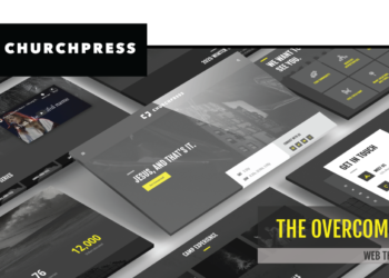
A high quality church website is just one step away with the new Overcomer web theme from ChurchPress.
With closures, restrictions and mask requirements still in place around the world due to the COVID-19 pandemic, sickness is top of mind for many people. It’s difficult to go a da
The coronavirus pandemic has upended and, in some cases, suspended life as we know it. With quarantine and stay home orders in place around the world, we are all experiencing chang
It’s all around us. The fear, chatter and uncertainty. How can we focus on something else? As we’re separated from family and friends and life continues to change, scary though
There are a lot of great resources out there to help people during this trying time. Here are some of our favorites! 1. BibleProject BibleProject offers hundreds of great, fr
As a global population, we’re facing a very real and frightening crisis in the COVID-19 pandemic. It’s a collective crisis, but individual experiences vary greatly. Some are ab
What will you choose? If you feed your faith, your fears will starve. On the other hand, if you feed your fears, your faith will starve. In unprecedented times like these, it feels